Metro Exit Sign
How do Nano Banana 2.1 Advanced, Alibaba Qwen Image 3.0 Pro, Qwen Image Max Uncensored and 40 other AI image models handle a signs & world scripts prompt? We ran this exact prompt once on each model, with no cherry-picking. Compare all 43 images side by side and copy the prompt to try it yourself.
Horizontal 3:2 photograph of an enamel metro sign mounted on a tiled wall, white capitals on a deep blue field reading exactly "ВЫХОД В ГОРОД", with a visible screw at each of the four corners. Slight wear on the enamel, even fluorescent light, no other signage in frame.


- Prompt adherence★★★★★★★★★★4.5
- Style fidelity★★★★★★★★★★4.5
- Quality & detail★★★★★★★★★★4.5
- Realism & anatomy★★★★★★★★★★4.5
- Composition & framing★★★★★★★★★★4.0
- Look & lighting★★★★★★★★★★4.0
- Text rendering★★★★★★★★★★5.0
The exact Cyrillic wording and all four corner screws are exceptionally clear.


- Prompt adherence★★★★★★★★★★5.0
- Style fidelity★★★★★★★★★★4.5
- Quality & detail★★★★★★★★★★4.5
- Realism & anatomy★★★★★★★★★★4.5
- Composition & framing★★★★★★★★★★4.5
- Look & lighting★★★★★★★★★★4.0
- Text rendering★★★★★★★★★★4.5
Exact Cyrillic wording, four screws, and enamel wear are all convincingly preserved.

- Prompt adherence★★★★★★★★★★4.0
- Style fidelity★★★★★★★★★★4.5
- Quality & detail★★★★★★★★★★4.5
- Realism & anatomy★★★★★★★★★★4.0
- Composition & framing★★★★★★★★★★4.0
- Look & lighting★★★★★★★★★★4.5
- Text rendering★★★★★★★★★★5.0
Exact Cyrillic text and four corner screws are excellent, though the enamel wear is heavier than requested.


- Prompt adherence★★★★★★★★★★3.5
- Style fidelity★★★★★★★★★★4.5
- Quality & detail★★★★★★★★★★4.0
- Realism & anatomy★★★★★★★★★★4.0
- Composition & framing★★★★★★★★★★4.0
- Look & lighting★★★★★★★★★★3.5
- Text rendering★★★★★★★★★★5.0
The text and sign are strong, but extra screws and a visible light fixture miss the brief.

- Prompt adherence★★★★★★★★★★4.5
- Style fidelity★★★★★★★★★★4.5
- Quality & detail★★★★★★★★★★4.5
- Realism & anatomy★★★★★★★★★★4.5
- Composition & framing★★★★★★★★★★4.0
- Look & lighting★★★★★★★★★★4.5
- Text rendering★★★★★★★★★★5.0
An excellent worn enamel sign with exact text and four corner screws.
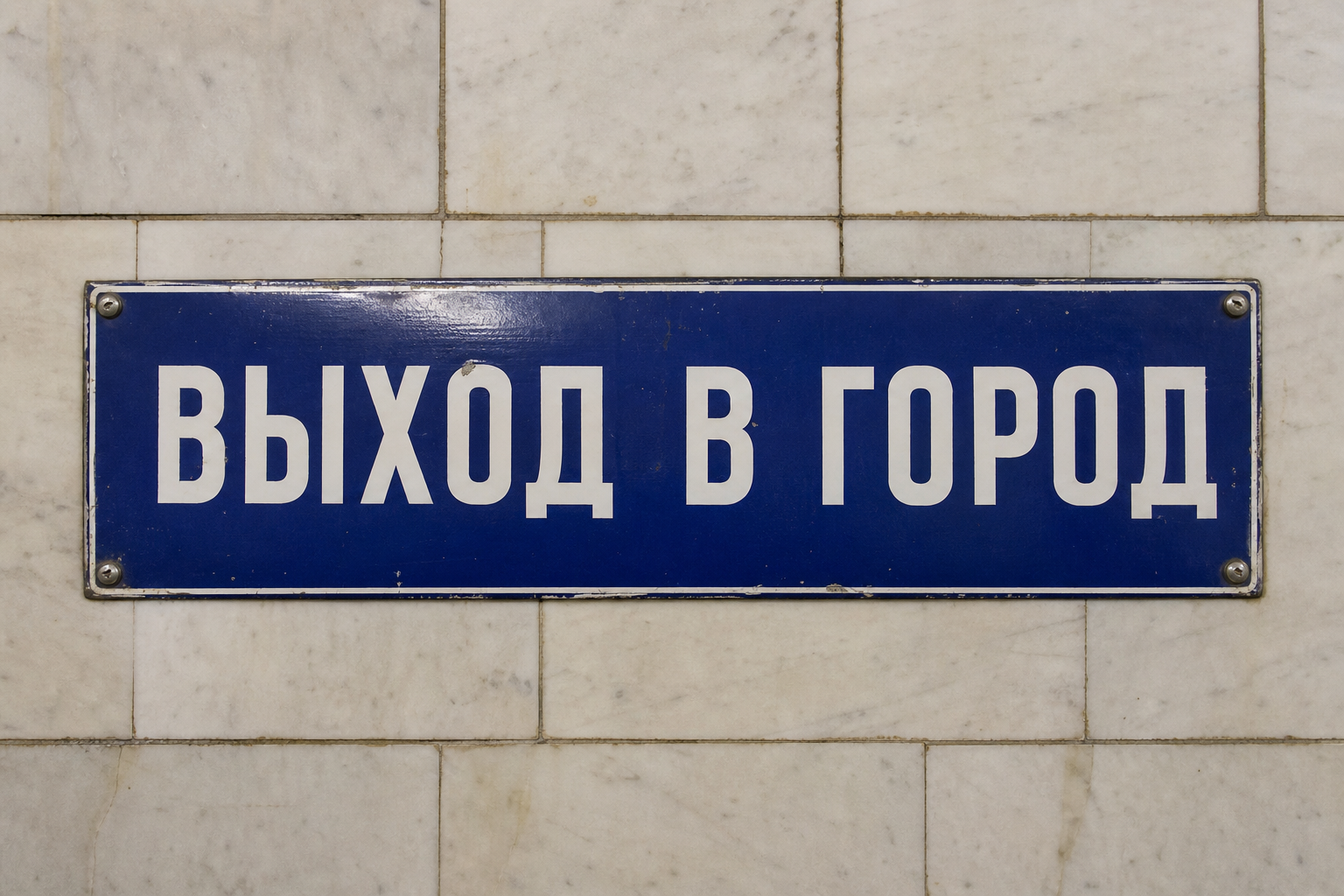
- Prompt adherence★★★★★★★★★★4.5
- Style fidelity★★★★★★★★★★4.5
- Quality & detail★★★★★★★★★★4.5
- Realism & anatomy★★★★★★★★★★4.5
- Composition & framing★★★★★★★★★★4.5
- Look & lighting★★★★★★★★★★4.0
- Text rendering★★★★★★★★★★5.0
An exact, legible sign with four correctly placed screws.

- Prompt adherence★★★★★★★★★★5.0
- Style fidelity★★★★★★★★★★4.5
- Quality & detail★★★★★★★★★★4.5
- Realism & anatomy★★★★★★★★★★4.5
- Composition & framing★★★★★★★★★★4.5
- Look & lighting★★★★★★★★★★4.0
- Text rendering★★★★★★★★★★5.0
Exact signage and authentic enamel wear are the strongest features.

- Prompt adherence★★★★★★★★★★5.0
- Style fidelity★★★★★★★★★★4.5
- Quality & detail★★★★★★★★★★4.5
- Realism & anatomy★★★★★★★★★★4.5
- Composition & framing★★★★★★★★★★4.5
- Look & lighting★★★★★★★★★★4.5
- Text rendering★★★★★★★★★★5.0
Clean photographic execution with exact text and four corner screws.

- Prompt adherence★★★★★★★★★★4.5
- Style fidelity★★★★★★★★★★4.5
- Quality & detail★★★★★★★★★★4.5
- Realism & anatomy★★★★★★★★★★4.5
- Composition & framing★★★★★★★★★★4.0
- Look & lighting★★★★★★★★★★4.0
- Text rendering★★★★★★★★★★5.0
Accurate text and mounting details are strong, while reflections and perspective slightly distract.

- Prompt adherence★★★★★★★★★★5.0
- Style fidelity★★★★★★★★★★4.5
- Quality & detail★★★★★★★★★★4.5
- Realism & anatomy★★★★★★★★★★4.5
- Composition & framing★★★★★★★★★★4.5
- Look & lighting★★★★★★★★★★4.0
- Text rendering★★★★★★★★★★5.0
Exact text, four screws, and strong aged-enamel detail.

- Prompt adherence★★★★★★★★★★5.0
- Style fidelity★★★★★★★★★★4.5
- Quality & detail★★★★★★★★★★4.5
- Realism & anatomy★★★★★★★★★★4.0
- Composition & framing★★★★★★★★★★4.0
- Look & lighting★★★★★★★★★★4.0
- Text rendering★★★★★★★★★★5.0
Exact Cyrillic text and four screws, with convincingly worn enamel.

- Prompt adherence★★★★★★★★★★5.0
- Style fidelity★★★★★★★★★★5.0
- Quality & detail★★★★★★★★★★4.5
- Realism & anatomy★★★★★★★★★★4.5
- Composition & framing★★★★★★★★★★4.5
- Look & lighting★★★★★★★★★★4.5
- Text rendering★★★★★★★★★★5.0
Exact text and four-corner screw layout are exceptionally well executed.


- Prompt adherence★★★★★★★★★★4.0
- Style fidelity★★★★★★★★★★4.5
- Quality & detail★★★★★★★★★★4.0
- Realism & anatomy★★★★★★★★★★4.0
- Composition & framing★★★★★★★★★★4.0
- Look & lighting★★★★★★★★★★4.0
- Text rendering★★★★★★★★★★5.0
All specified text and four screws are present, though wear is heavier than slight.

- Prompt adherence★★★★★★★★★★3.5
- Style fidelity★★★★★★★★★★4.5
- Quality & detail★★★★★★★★★★4.0
- Realism & anatomy★★★★★★★★★★4.0
- Composition & framing★★★★★★★★★★4.0
- Look & lighting★★★★★★★★★★4.5
- Text rendering★★★★★★★★★★5.0
Correct text is clear, but two extra center screws violate the required four-corner arrangement.

- Prompt adherence★★★★★★★★★★2.0
- Style fidelity★★★★★★★★★★4.0
- Quality & detail★★★★★★★★★★4.0
- Realism & anatomy★★★★★★★★★★4.0
- Composition & framing★★★★★★★★★★3.5
- Look & lighting★★★★★★★★★★4.0
- Text rendering★★★★★★★★★★1.0
The sign text is visibly garbled rather than the requested Cyrillic phrase.

- Prompt adherence★★★★★★★★★★5.0
- Style fidelity★★★★★★★★★★5.0
- Quality & detail★★★★★★★★★★4.5
- Realism & anatomy★★★★★★★★★★4.5
- Composition & framing★★★★★★★★★★4.0
- Look & lighting★★★★★★★★★★4.5
- Text rendering★★★★★★★★★★5.0
It precisely renders the requested text, four screws, tiles, and worn blue enamel sign.

- Prompt adherence★★★★★★★★★★3.0
- Style fidelity★★★★★★★★★★4.5
- Quality & detail★★★★★★★★★★4.0
- Realism & anatomy★★★★★★★★★★4.0
- Composition & framing★★★★★★★★★★3.5
- Look & lighting★★★★★★★★★★4.0
- Text rendering★★★★★★★★★★5.0
The text is correct, but it is stacked and the sign has extra screws.

- Prompt adherence★★★★★★★★★★4.0
- Style fidelity★★★★★★★★★★4.5
- Quality & detail★★★★★★★★★★4.5
- Realism & anatomy★★★★★★★★★★4.5
- Composition & framing★★★★★★★★★★4.0
- Look & lighting★★★★★★★★★★4.0
- Text rendering★★★★★★★★★★5.0
The exact text is clear, but it is split across two lines.

- Prompt adherence★★★★★★★★★★4.5
- Style fidelity★★★★★★★★★★4.5
- Quality & detail★★★★★★★★★★4.5
- Realism & anatomy★★★★★★★★★★4.0
- Composition & framing★★★★★★★★★★4.0
- Look & lighting★★★★★★★★★★4.0
- Text rendering★★★★★★★★★★5.0
It fulfills the requested sign details cleanly, with mild glare and a slight tilt.

- Prompt adherence★★★★★★★★★★4.0
- Style fidelity★★★★★★★★★★4.5
- Quality & detail★★★★★★★★★★4.5
- Realism & anatomy★★★★★★★★★★4.5
- Composition & framing★★★★★★★★★★4.5
- Look & lighting★★★★★★★★★★4.0
- Text rendering★★★★★★★★★★5.0
The exact sign specification is met, with glare and overdone weathering the main distractions.

- Prompt adherence★★★★★★★★★★4.5
- Style fidelity★★★★★★★★★★4.5
- Quality & detail★★★★★★★★★★4.5
- Realism & anatomy★★★★★★★★★★4.5
- Composition & framing★★★★★★★★★★4.5
- Look & lighting★★★★★★★★★★4.0
- Text rendering★★★★★★★★★★5.0
Exact text and hardware, though the enamel shows only limited wear.

- Prompt adherence★★★★★★★★★★4.5
- Style fidelity★★★★★★★★★★4.0
- Quality & detail★★★★★★★★★★4.0
- Realism & anatomy★★★★★★★★★★4.0
- Composition & framing★★★★★★★★★★3.5
- Look & lighting★★★★★★★★★★3.5
- Text rendering★★★★★★★★★★5.0
It fulfills the exact text and mounting brief, but the lighting is visibly warm rather than fluorescent-neutral.

- Prompt adherence★★★★★★★★★★2.0
- Style fidelity★★★★★★★★★★4.0
- Quality & detail★★★★★★★★★★4.0
- Realism & anatomy★★★★★★★★★★4.0
- Composition & framing★★★★★★★★★★3.5
- Look & lighting★★★★★★★★★★4.0
- Text rendering—
The image is polished, but gibberish Cyrillic and six screws miss crucial requirements.

- Prompt adherence★★★★★★★★★★3.0
- Style fidelity★★★★★★★★★★5.0
- Quality & detail★★★★★★★★★★4.5
- Realism & anatomy★★★★★★★★★★4.5
- Composition & framing★★★★★★★★★★4.5
- Look & lighting★★★★★★★★★★4.5
- Text rendering★★★★★★★★★★1.0
The requested Cyrillic phrase is visibly malformed despite strong sign rendering.
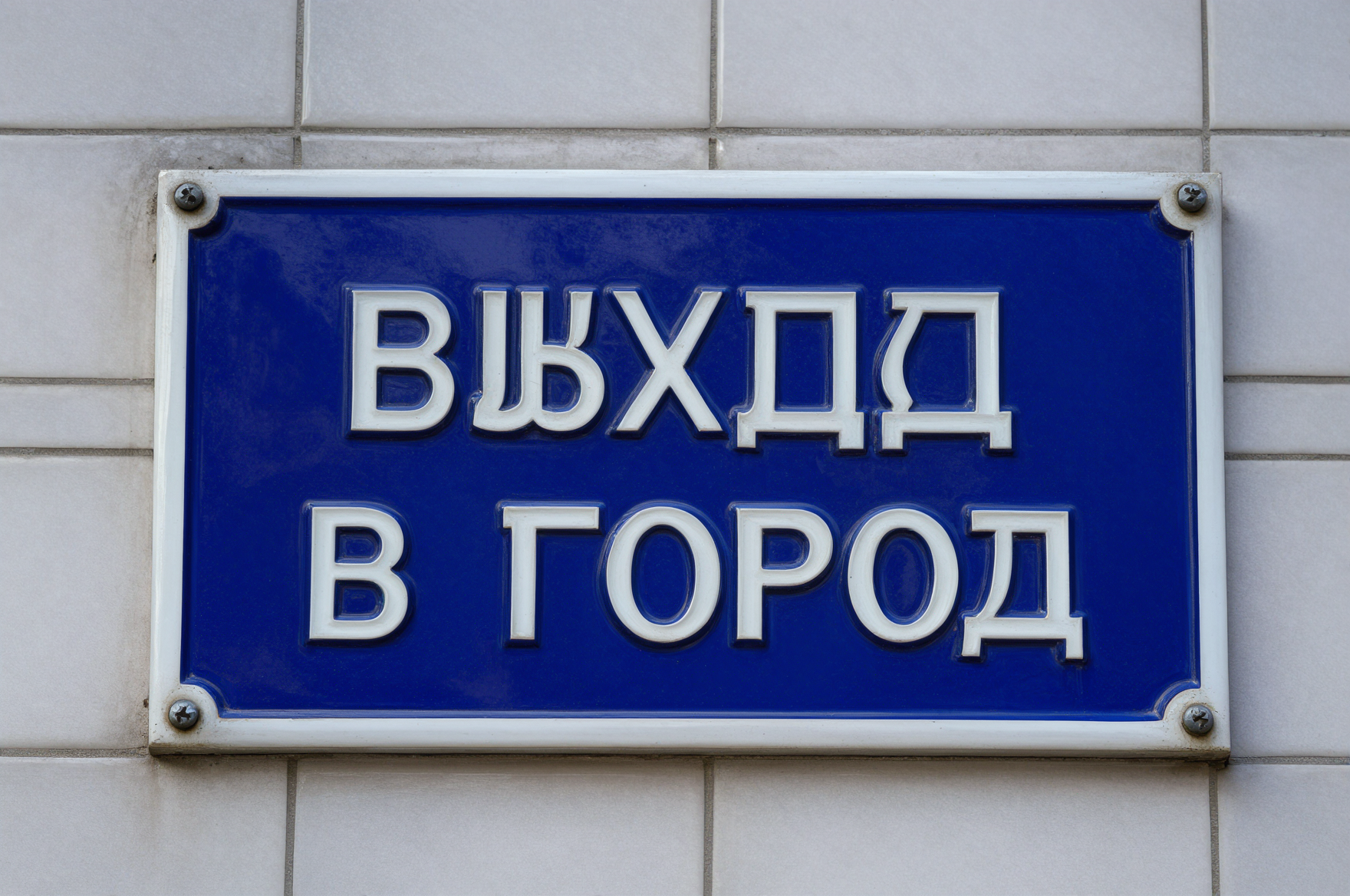
- Prompt adherence★★★★★★★★★★2.5
- Style fidelity★★★★★★★★★★4.0
- Quality & detail★★★★★★★★★★3.5
- Realism & anatomy★★★★★★★★★★3.5
- Composition & framing★★★★★★★★★★4.0
- Look & lighting★★★★★★★★★★4.0
- Text rendering★★★★★★★★★★1.5
The scene composition works, but the first word of the requested sign text is misspelled.

- Prompt adherence★★★★★★★★★★2.5
- Style fidelity★★★★★★★★★★4.0
- Quality & detail★★★★★★★★★★3.0
- Realism & anatomy★★★★★★★★★★3.5
- Composition & framing★★★★★★★★★★3.5
- Look & lighting★★★★★★★★★★3.5
- Text rendering★★★★★★★★★★1.5
The first word is misspelled and the image is visibly soft with a corner artifact.

- Prompt adherence★★★★★★★★★★4.5
- Style fidelity★★★★★★★★★★4.5
- Quality & detail★★★★★★★★★★4.0
- Realism & anatomy★★★★★★★★★★4.0
- Composition & framing★★★★★★★★★★3.5
- Look & lighting★★★★★★★★★★4.0
- Text rendering★★★★★★★★★★5.0
It nails the requested Cyrillic text, four screws, and tiled setting.

- Prompt adherence★★★★★★★★★★3.5
- Style fidelity★★★★★★★★★★4.0
- Quality & detail★★★★★★★★★★4.0
- Realism & anatomy★★★★★★★★★★4.0
- Composition & framing★★★★★★★★★★4.0
- Look & lighting★★★★★★★★★★4.0
- Text rendering★★★★★★★★★★5.0
Correct, readable text and mounting are undermined by the two-line layout and heavy wear.

- Prompt adherence★★★★★★★★★★1.5
- Style fidelity★★★★★★★★★★3.5
- Quality & detail★★★★★★★★★★3.5
- Realism & anatomy★★★★★★★★★★3.5
- Composition & framing★★★★★★★★★★3.0
- Look & lighting★★★★★★★★★★3.5
- Text rendering★★★★★★★★★★0.5
Badly corrupted text and two extra screws miss the required sign design.

- Prompt adherence★★★★★★★★★★2.0
- Style fidelity★★★★★★★★★★3.5
- Quality & detail★★★★★★★★★★3.5
- Realism & anatomy★★★★★★★★★★3.5
- Composition & framing★★★★★★★★★★3.5
- Look & lighting★★★★★★★★★★3.5
- Text rendering★★★★★★★★★★0.5
Malformed and misspelled Cyrillic makes the requested text fail.

- Prompt adherence★★★★★★★★★★2.5
- Style fidelity★★★★★★★★★★4.0
- Quality & detail★★★★★★★★★★4.0
- Realism & anatomy★★★★★★★★★★4.0
- Composition & framing★★★★★★★★★★3.5
- Look & lighting★★★★★★★★★★4.0
- Text rendering★★★★★★★★★★2.0
The sign text has the wrong case, layout, and wording treatment.

- Prompt adherence★★★★★★★★★★4.5
- Style fidelity★★★★★★★★★★4.0
- Quality & detail★★★★★★★★★★4.0
- Realism & anatomy★★★★★★★★★★4.0
- Composition & framing★★★★★★★★★★3.5
- Look & lighting★★★★★★★★★★3.5
- Text rendering★★★★★★★★★★5.0
It gets the exact text and four screws, with raised lettering and warm light as minor misses.

- Prompt adherence★★★★★★★★★★3.5
- Style fidelity★★★★★★★★★★4.0
- Quality & detail★★★★★★★★★★3.5
- Realism & anatomy★★★★★★★★★★3.5
- Composition & framing★★★★★★★★★★3.5
- Look & lighting★★★★★★★★★★3.5
- Text rendering★★★★★★★★★★5.0
The exact text and corner screws are present, but wear and empty holes are far too pronounced.

- Prompt adherence★★★★★★★★★★4.0
- Style fidelity★★★★★★★★★★5.0
- Quality & detail★★★★★★★★★★4.5
- Realism & anatomy★★★★★★★★★★4.5
- Composition & framing★★★★★★★★★★4.0
- Look & lighting★★★★★★★★★★4.0
- Text rendering★★★★★★★★★★5.0
The typography and aged enamel are excellent, though the text is split across two lines.

- Prompt adherence★★★★★★★★★★2.5
- Style fidelity★★★★★★★★★★4.5
- Quality & detail★★★★★★★★★★4.0
- Realism & anatomy★★★★★★★★★★4.0
- Composition & framing★★★★★★★★★★4.0
- Look & lighting★★★★★★★★★★4.0
- Text rendering★★★★★★★★★★0.5
The sign form is convincing, but the required Cyrillic text is entirely wrong.

- Prompt adherence★★★★★★★★★★1.5
- Style fidelity★★★★★★★★★★3.5
- Quality & detail★★★★★★★★★★2.5
- Realism & anatomy★★★★★★★★★★3.0
- Composition & framing★★★★★★★★★★3.5
- Look & lighting★★★★★★★★★★3.0
- Text rendering—
The blue sign and four screws are present, but the text is entirely wrong.

- Prompt adherence★★★★★★★★★★3.5
- Style fidelity★★★★★★★★★★4.5
- Quality & detail★★★★★★★★★★4.0
- Realism & anatomy★★★★★★★★★★4.5
- Composition & framing★★★★★★★★★★3.5
- Look & lighting★★★★★★★★★★3.5
- Text rendering★★★★★★★★★★5.0
Correct lettering and hardware are undermined by the dominant visible light fixture and heavy wear.

- Prompt adherence★★★★★★★★★★1.0
- Style fidelity★★★★★★★★★★3.5
- Quality & detail★★★★★★★★★★3.0
- Realism & anatomy★★★★★★★★★★2.5
- Composition & framing★★★★★★★★★★3.5
- Look & lighting★★★★★★★★★★3.0
- Text rendering★★★★★★★★★★0.5
It reverses the requested colour treatment and produces severely garbled text.

- Prompt adherence★★★★★★★★★★2.0
- Style fidelity★★★★★★★★★★3.5
- Quality & detail★★★★★★★★★★3.5
- Realism & anatomy★★★★★★★★★★3.5
- Composition & framing★★★★★★★★★★3.5
- Look & lighting★★★★★★★★★★3.5
- Text rendering★★★★★★★★★★1.0
The requested Cyrillic text is misspelled and the sign has extra fasteners.

- Prompt adherence★★★★★★★★★★1.0
- Style fidelity★★★★★★★★★★3.5
- Quality & detail★★★★★★★★★★3.5
- Realism & anatomy★★★★★★★★★★3.5
- Composition & framing★★★★★★★★★★3.0
- Look & lighting★★★★★★★★★★3.0
- Text rendering—
Wrong script, excessive wear, extra screws, and a visible fixture break the brief.

- Prompt adherence★★★★★★★★★★2.0
- Style fidelity★★★★★★★★★★4.0
- Quality & detail★★★★★★★★★★4.0
- Realism & anatomy★★★★★★★★★★4.0
- Composition & framing★★★★★★★★★★3.5
- Look & lighting★★★★★★★★★★3.5
- Text rendering—
The photographic sign is clean, but the text is wrong and the frame is not 3:2.
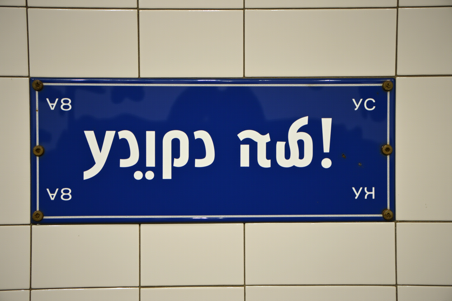
- Prompt adherence★★★★★★★★★★1.0
- Style fidelity★★★★★★★★★★3.5
- Quality & detail★★★★★★★★★★3.5
- Realism & anatomy★★★★★★★★★★3.5
- Composition & framing★★★★★★★★★★3.5
- Look & lighting★★★★★★★★★★3.0
- Text rendering—
Wrong upside-down script, extra labels, and six screws fail the requested sign.
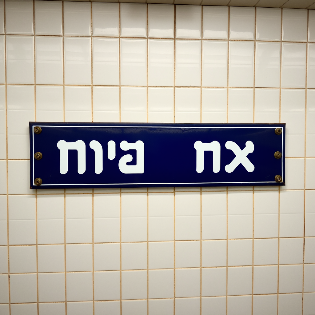
- Prompt adherence★★★★★★★★★★1.5
- Style fidelity★★★★★★★★★★4.0
- Quality & detail★★★★★★★★★★3.5
- Realism & anatomy★★★★★★★★★★3.5
- Composition & framing★★★★★★★★★★3.5
- Look & lighting★★★★★★★★★★3.5
- Text rendering—
Wrong script, square framing, and six screws miss the core specification.


