Turkish Café Board
How do Nano Banana 2.1 Advanced, Alibaba Qwen Image 3.0 Pro, Qwen Image Max Uncensored and 40 other AI image models handle a signs & world scripts prompt? We ran this exact prompt once on each model, with no cherry-picking. Compare all 43 images side by side and copy the prompt to try it yourself.
Horizontal 3:2 photograph of a black A-frame chalkboard on a pavement outside a café, reading exactly "GÜNÜN KAHVESİ — 45 TL" in clean white chalk capitals with correct Turkish characters, including the dotted capital İ and the dotless ı where they belong. Nothing else is written on the board. Morning light, shallow depth of field.


- Prompt adherence★★★★★★★★★★3.5
- Style fidelity★★★★★★★★★★4.5
- Quality & detail★★★★★★★★★★4.5
- Realism & anatomy★★★★★★★★★★4.5
- Composition & framing★★★★★★★★★★4.0
- Look & lighting★★★★★★★★★★4.5
- Text rendering★★★★★★★★★★3.0
The café scene is convincing, but the final dotted Turkish İ is not rendered reliably.


- Prompt adherence★★★★★★★★★★4.5
- Style fidelity★★★★★★★★★★4.5
- Quality & detail★★★★★★★★★★4.5
- Realism & anatomy★★★★★★★★★★4.0
- Composition & framing★★★★★★★★★★4.0
- Look & lighting★★★★★★★★★★4.0
- Text rendering★★★★★★★★★★4.5
The board text is crisp and nearly exact, with a convincing café setting and natural morning light.
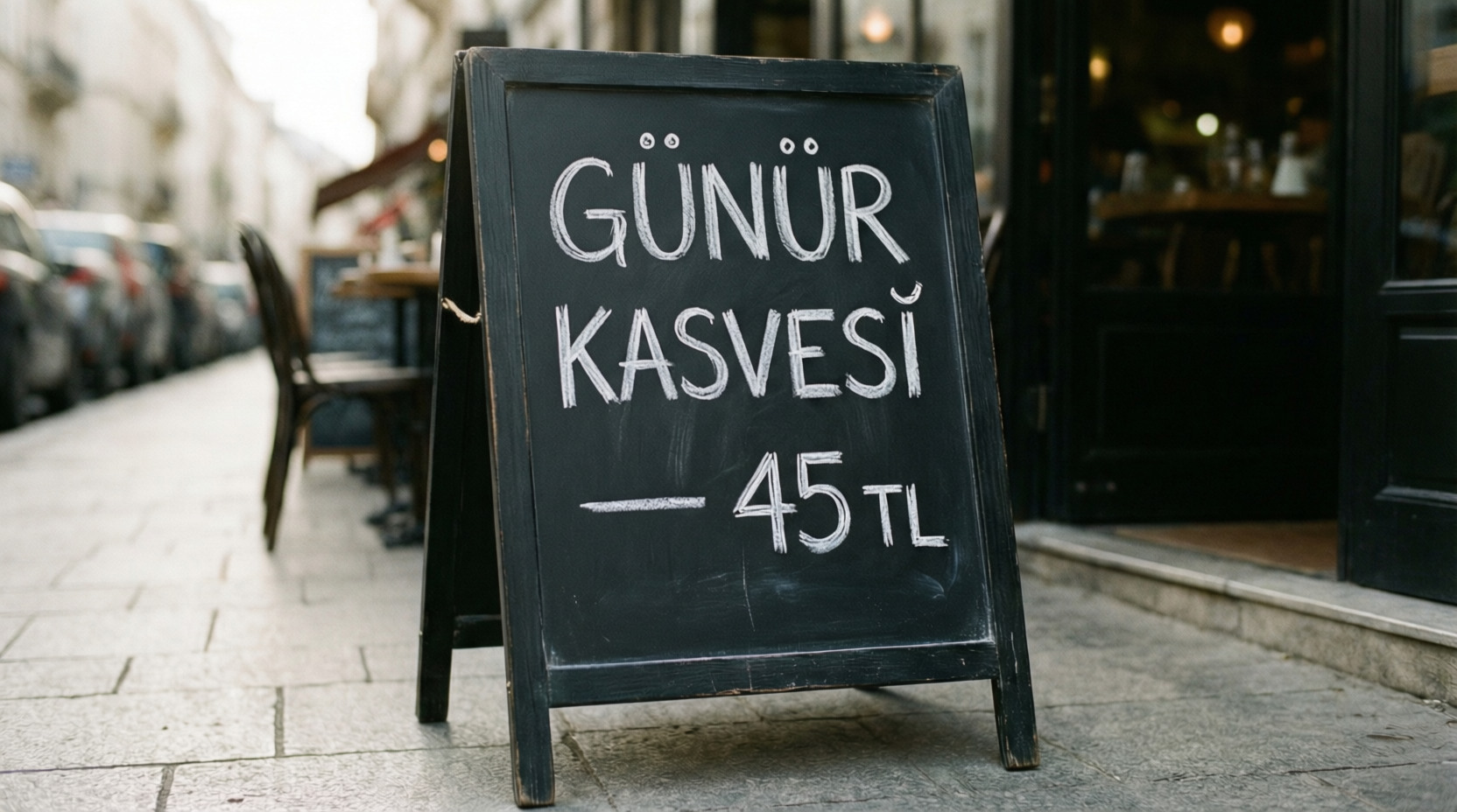
- Prompt adherence★★★★★★★★★★3.0
- Style fidelity★★★★★★★★★★4.0
- Quality & detail★★★★★★★★★★4.5
- Realism & anatomy★★★★★★★★★★4.5
- Composition & framing★★★★★★★★★★4.5
- Look & lighting★★★★★★★★★★4.5
- Text rendering★★★★★★★★★★1.0
The board text is misspelled, so it fails the exact Turkish wording requirement.


- Prompt adherence★★★★★★★★★★3.5
- Style fidelity★★★★★★★★★★4.5
- Quality & detail★★★★★★★★★★4.5
- Realism & anatomy★★★★★★★★★★4.5
- Composition & framing★★★★★★★★★★4.5
- Look & lighting★★★★★★★★★★4.0
- Text rendering★★★★★★★★★★5.0
Crisp, exact chalk text and strong depth of field are weakened only by the brown frame.

- Prompt adherence★★★★★★★★★★3.5
- Style fidelity★★★★★★★★★★4.5
- Quality & detail★★★★★★★★★★4.5
- Realism & anatomy★★★★★★★★★★4.5
- Composition & framing★★★★★★★★★★4.5
- Look & lighting★★★★★★★★★★4.0
- Text rendering★★★★★★★★★★5.0
Excellent exact lettering and café photograph, held back by the weathered brown frame.

- Prompt adherence★★★★★★★★★★5.0
- Style fidelity★★★★★★★★★★5.0
- Quality & detail★★★★★★★★★★5.0
- Realism & anatomy★★★★★★★★★★5.0
- Composition & framing★★★★★★★★★★4.0
- Look & lighting★★★★★★★★★★4.5
- Text rendering★★★★★★★★★★5.0
It delivers exact Turkish lettering with an exceptionally convincing morning café scene.

- Prompt adherence★★★★★★★★★★5.0
- Style fidelity★★★★★★★★★★5.0
- Quality & detail★★★★★★★★★★5.0
- Realism & anatomy★★★★★★★★★★5.0
- Composition & framing★★★★★★★★★★4.5
- Look & lighting★★★★★★★★★★4.5
- Text rendering★★★★★★★★★★5.0
The board text is exact, cleanly chalked, and integrated into a highly realistic café exterior.

- Prompt adherence★★★★★★★★★★5.0
- Style fidelity★★★★★★★★★★5.0
- Quality & detail★★★★★★★★★★5.0
- Realism & anatomy★★★★★★★★★★5.0
- Composition & framing★★★★★★★★★★4.5
- Look & lighting★★★★★★★★★★4.5
- Text rendering★★★★★★★★★★5.0
Exact Turkish wording is clearly legible in a strong, sunlit photographic composition.

- Prompt adherence★★★★★★★★★★5.0
- Style fidelity★★★★★★★★★★5.0
- Quality & detail★★★★★★★★★★4.5
- Realism & anatomy★★★★★★★★★★4.5
- Composition & framing★★★★★★★★★★4.5
- Look & lighting★★★★★★★★★★4.5
- Text rendering★★★★★★★★★★5.0
Exact, highly legible Turkish text anchors a polished and realistic café scene.

- Prompt adherence★★★★★★★★★★4.5
- Style fidelity★★★★★★★★★★5.0
- Quality & detail★★★★★★★★★★5.0
- Realism & anatomy★★★★★★★★★★5.0
- Composition & framing★★★★★★★★★★4.5
- Look & lighting★★★★★★★★★★4.5
- Text rendering★★★★★★★★★★5.0
The lettering and café realism are excellent, with only the brown frame softening the black A-frame match.

- Prompt adherence★★★★★★★★★★5.0
- Style fidelity★★★★★★★★★★5.0
- Quality & detail★★★★★★★★★★5.0
- Realism & anatomy★★★★★★★★★★5.0
- Composition & framing★★★★★★★★★★4.5
- Look & lighting★★★★★★★★★★4.5
- Text rendering★★★★★★★★★★5.0
Exact, legible Turkish lettering sits on a convincingly photographed café chalkboard.

- Prompt adherence★★★★★★★★★★5.0
- Style fidelity★★★★★★★★★★5.0
- Quality & detail★★★★★★★★★★4.5
- Realism & anatomy★★★★★★★★★★4.5
- Composition & framing★★★★★★★★★★4.5
- Look & lighting★★★★★★★★★★4.5
- Text rendering★★★★★★★★★★5.0
Exact Turkish lettering is exceptionally clear in a convincing café photograph.


- Prompt adherence★★★★★★★★★★2.5
- Style fidelity★★★★★★★★★★4.5
- Quality & detail★★★★★★★★★★4.5
- Realism & anatomy★★★★★★★★★★4.0
- Composition & framing★★★★★★★★★★4.5
- Look & lighting★★★★★★★★★★4.5
- Text rendering★★★★★★★★★★1.0
The board text contains multiple clear spelling and punctuation errors.

- Prompt adherence★★★★★★★★★★3.0
- Style fidelity★★★★★★★★★★4.5
- Quality & detail★★★★★★★★★★4.0
- Realism & anatomy★★★★★★★★★★4.0
- Composition & framing★★★★★★★★★★4.0
- Look & lighting★★★★★★★★★★4.0
- Text rendering★★★★★★★★★★2.0
The photo is clean, but KAHVESİ is visibly misspelled as KAHDESİ.

- Prompt adherence★★★★★★★★★★1.5
- Style fidelity★★★★★★★★★★3.5
- Quality & detail★★★★★★★★★★3.5
- Realism & anatomy★★★★★★★★★★3.5
- Composition & framing★★★★★★★★★★3.5
- Look & lighting★★★★★★★★★★3.5
- Text rendering★★★★★★★★★★1.5
Square crop, brown frame, title case, and a tilde depart from the tightly specified board.
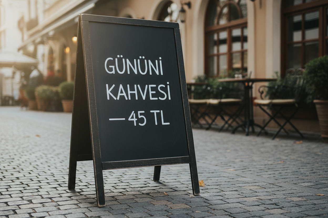
- Prompt adherence★★★★★★★★★★3.0
- Style fidelity★★★★★★★★★★4.5
- Quality & detail★★★★★★★★★★4.5
- Realism & anatomy★★★★★★★★★★4.5
- Composition & framing★★★★★★★★★★4.5
- Look & lighting★★★★★★★★★★4.5
- Text rendering★★★★★★★★★★2.5
The board adds an incorrect capital İ to GÜNÜN despite an otherwise polished scene.

- Prompt adherence★★★★★★★★★★3.0
- Style fidelity★★★★★★★★★★4.0
- Quality & detail★★★★★★★★★★4.0
- Realism & anatomy★★★★★★★★★★4.0
- Composition & framing★★★★★★★★★★4.0
- Look & lighting★★★★★★★★★★3.5
- Text rendering★★★★★★★★★★2.5
The tilde in place of the required dash makes an otherwise plausible café board fail exact text.
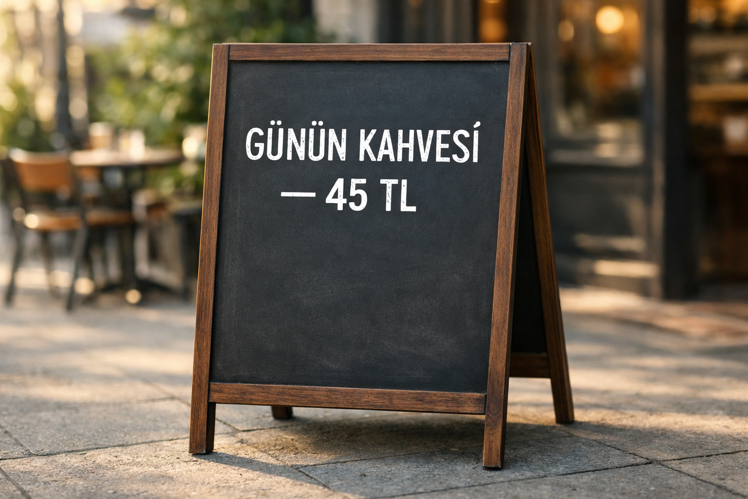
- Prompt adherence★★★★★★★★★★4.5
- Style fidelity★★★★★★★★★★4.5
- Quality & detail★★★★★★★★★★4.5
- Realism & anatomy★★★★★★★★★★4.5
- Composition & framing★★★★★★★★★★4.5
- Look & lighting★★★★★★★★★★4.5
- Text rendering★★★★★★★★★★5.0
The exact text is crisp and complete in a polished, natural café photograph.

- Prompt adherence★★★★★★★★★★5.0
- Style fidelity★★★★★★★★★★5.0
- Quality & detail★★★★★★★★★★4.5
- Realism & anatomy★★★★★★★★★★4.5
- Composition & framing★★★★★★★★★★4.5
- Look & lighting★★★★★★★★★★4.5
- Text rendering★★★★★★★★★★5.0
It cleanly delivers the exact Turkish chalkboard wording in the requested setting.

- Prompt adherence★★★★★★★★★★4.0
- Style fidelity★★★★★★★★★★5.0
- Quality & detail★★★★★★★★★★4.5
- Realism & anatomy★★★★★★★★★★4.5
- Composition & framing★★★★★★★★★★4.5
- Look & lighting★★★★★★★★★★4.5
- Text rendering★★★★★★★★★★4.0
The text is very clear but adds a visible final period not requested.

- Prompt adherence★★★★★★★★★★5.0
- Style fidelity★★★★★★★★★★5.0
- Quality & detail★★★★★★★★★★4.5
- Realism & anatomy★★★★★★★★★★4.5
- Composition & framing★★★★★★★★★★4.5
- Look & lighting★★★★★★★★★★4.5
- Text rendering★★★★★★★★★★5.0
The exact sign text and shallow-focus café setting are both convincingly achieved.

- Prompt adherence★★★★★★★★★★3.5
- Style fidelity★★★★★★★★★★4.5
- Quality & detail★★★★★★★★★★4.0
- Realism & anatomy★★★★★★★★★★4.0
- Composition & framing★★★★★★★★★★4.0
- Look & lighting★★★★★★★★★★4.0
- Text rendering★★★★★★★★★★3.0
Clean, well-lit A-frame café image, but the requested em dash is rendered as a joined hyphen before the price.

- Prompt adherence★★★★★★★★★★4.5
- Style fidelity★★★★★★★★★★4.5
- Quality & detail★★★★★★★★★★4.5
- Realism & anatomy★★★★★★★★★★4.5
- Composition & framing★★★★★★★★★★4.0
- Look & lighting★★★★★★★★★★4.0
- Text rendering★★★★★★★★★★4.5
Near-exact Turkish chalkboard scene, but the dash is a short hyphen rather than an em dash.

- Prompt adherence★★★★★★★★★★3.0
- Style fidelity★★★★★★★★★★4.5
- Quality & detail★★★★★★★★★★4.5
- Realism & anatomy★★★★★★★★★★4.5
- Composition & framing★★★★★★★★★★4.0
- Look & lighting★★★★★★★★★★4.0
- Text rendering★★★★★★★★★★1.5
The otherwise convincing sign misspells KAHVESİ as KAHDEŞİ.

- Prompt adherence★★★★★★★★★★4.0
- Style fidelity★★★★★★★★★★4.5
- Quality & detail★★★★★★★★★★4.0
- Realism & anatomy★★★★★★★★★★4.0
- Composition & framing★★★★★★★★★★4.5
- Look & lighting★★★★★★★★★★4.0
- Text rendering★★★★★★★★★★4.0
The closest match has exact readable wording but stray chalk marks violate the clean-board instruction.

- Prompt adherence★★★★★★★★★★5.0
- Style fidelity★★★★★★★★★★4.5
- Quality & detail★★★★★★★★★★4.5
- Realism & anatomy★★★★★★★★★★4.0
- Composition & framing★★★★★★★★★★4.5
- Look & lighting★★★★★★★★★★4.5
- Text rendering★★★★★★★★★★5.0
The requested wording is exact and exceptionally readable, despite a slightly polished look.

- Prompt adherence★★★★★★★★★★4.5
- Style fidelity★★★★★★★★★★4.5
- Quality & detail★★★★★★★★★★4.5
- Realism & anatomy★★★★★★★★★★4.5
- Composition & framing★★★★★★★★★★4.5
- Look & lighting★★★★★★★★★★4.5
- Text rendering★★★★★★★★★★4.5
Strong black A-frame photograph with correct Turkish wording, though the dash sits slightly low relative to the phrase.

- Prompt adherence★★★★★★★★★★4.5
- Style fidelity★★★★★★★★★★4.5
- Quality & detail★★★★★★★★★★4.5
- Realism & anatomy★★★★★★★★★★4.5
- Composition & framing★★★★★★★★★★4.5
- Look & lighting★★★★★★★★★★4.5
- Text rendering★★★★★★★★★★4.5
Excellent exact-text café board with authentic morning depth, only slightly scuffed rather than perfectly clean chalkwork.

- Prompt adherence★★★★★★★★★★2.0
- Style fidelity★★★★★★★★★★4.5
- Quality & detail★★★★★★★★★★4.0
- Realism & anatomy★★★★★★★★★★4.0
- Composition & framing★★★★★★★★★★4.5
- Look & lighting★★★★★★★★★★4.0
- Text rendering★★★★★★★★★★1.0
The café sign is well composed, but the Turkish text is substantially incorrect and adds decoration.

- Prompt adherence★★★★★★★★★★3.5
- Style fidelity★★★★★★★★★★4.5
- Quality & detail★★★★★★★★★★4.5
- Realism & anatomy★★★★★★★★★★4.5
- Composition & framing★★★★★★★★★★4.5
- Look & lighting★★★★★★★★★★4.0
- Text rendering★★★★★★★★★★3.5
The scene is convincing, but the requested em dash and spacing are not exact.

- Prompt adherence★★★★★★★★★★2.0
- Style fidelity★★★★★★★★★★4.5
- Quality & detail★★★★★★★★★★4.5
- Realism & anatomy★★★★★★★★★★4.5
- Composition & framing★★★★★★★★★★4.0
- Look & lighting★★★★★★★★★★4.0
- Text rendering★★★★★★★★★★1.0
The lettering is strongly rendered but the required text and punctuation are wrong.

- Prompt adherence★★★★★★★★★★4.0
- Style fidelity★★★★★★★★★★4.0
- Quality & detail★★★★★★★★★★4.5
- Realism & anatomy★★★★★★★★★★4.5
- Composition & framing★★★★★★★★★★3.5
- Look & lighting★★★★★★★★★★4.0
- Text rendering★★★★★★★★★★5.0
The wording is exact and highly legible, but the brown cropped frame is less faithful to the requested black A-frame.

- Prompt adherence★★★★★★★★★★3.0
- Style fidelity★★★★★★★★★★4.0
- Quality & detail★★★★★★★★★★4.0
- Realism & anatomy★★★★★★★★★★4.0
- Composition & framing★★★★★★★★★★3.5
- Look & lighting★★★★★★★★★★4.0
- Text rendering★★★★★★★★★★2.0
The café scene is convincing, but the price punctuation and added underline miss the exact board text.

- Prompt adherence★★★★★★★★★★3.0
- Style fidelity★★★★★★★★★★4.0
- Quality & detail★★★★★★★★★★4.0
- Realism & anatomy★★★★★★★★★★4.5
- Composition & framing★★★★★★★★★★4.0
- Look & lighting★★★★★★★★★★4.0
- Text rendering★★★★★★★★★★5.0
The exact text is excellent, but the brown-framed board and non-3:2 crop miss the brief.

- Prompt adherence★★★★★★★★★★2.5
- Style fidelity★★★★★★★★★★4.5
- Quality & detail★★★★★★★★★★4.0
- Realism & anatomy★★★★★★★★★★4.0
- Composition & framing★★★★★★★★★★4.0
- Look & lighting★★★★★★★★★★4.0
- Text rendering★★★★★★★★★★1.0
Multiple misspellings make the requested Turkish wording fail.

- Prompt adherence★★★★★★★★★★2.0
- Style fidelity★★★★★★★★★★3.5
- Quality & detail★★★★★★★★★★3.0
- Realism & anatomy★★★★★★★★★★3.5
- Composition & framing★★★★★★★★★★3.5
- Look & lighting★★★★★★★★★★3.0
- Text rendering★★★★★★★★★★2.0
Square framing and a missing dash undermine rough chalk lettering.

- Prompt adherence★★★★★★★★★★4.0
- Style fidelity★★★★★★★★★★4.5
- Quality & detail★★★★★★★★★★4.5
- Realism & anatomy★★★★★★★★★★4.5
- Composition & framing★★★★★★★★★★4.0
- Look & lighting★★★★★★★★★★4.5
- Text rendering★★★★★★★★★★4.0
A conventional hyphen replaces the requested em dash in otherwise accurate text.

- Prompt adherence★★★★★★★★★★2.0
- Style fidelity★★★★★★★★★★3.5
- Quality & detail★★★★★★★★★★3.5
- Realism & anatomy★★★★★★★★★★3.5
- Composition & framing★★★★★★★★★★3.5
- Look & lighting★★★★★★★★★★3.5
- Text rendering★★★★★★★★★★1.5
It is a clear café-board photograph, but square title-case text uses the wrong punctuation.

- Prompt adherence★★★★★★★★★★2.0
- Style fidelity★★★★★★★★★★3.5
- Quality & detail★★★★★★★★★★3.5
- Realism & anatomy★★★★★★★★★★3.5
- Composition & framing★★★★★★★★★★3.5
- Look & lighting★★★★★★★★★★3.5
- Text rendering★★★★★★★★★★1.5
Square framing and title-case text with a tilde and exclamation mark miss the precise sign brief.

- Prompt adherence★★★★★★★★★★2.5
- Style fidelity★★★★★★★★★★4.0
- Quality & detail★★★★★★★★★★4.0
- Realism & anatomy★★★★★★★★★★4.0
- Composition & framing★★★★★★★★★★4.0
- Look & lighting★★★★★★★★★★4.0
- Text rendering★★★★★★★★★★2.0
The black café A-frame is well presented, but mixed-case text and incorrect dash formatting miss the exact lettering request.

- Prompt adherence★★★★★★★★★★2.0
- Style fidelity★★★★★★★★★★4.0
- Quality & detail★★★★★★★★★★4.0
- Realism & anatomy★★★★★★★★★★4.0
- Composition & framing★★★★★★★★★★4.0
- Look & lighting★★★★★★★★★★3.5
- Text rendering★★★★★★★★★★1.0
Attractive café composition, but extra lower writing and an incorrect joined price fail the exact-text requirement.
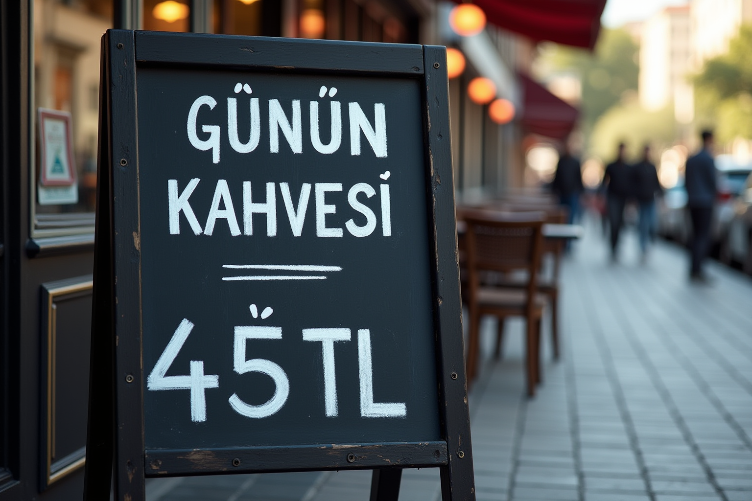
- Prompt adherence★★★★★★★★★★3.0
- Style fidelity★★★★★★★★★★4.0
- Quality & detail★★★★★★★★★★4.5
- Realism & anatomy★★★★★★★★★★4.0
- Composition & framing★★★★★★★★★★3.5
- Look & lighting★★★★★★★★★★4.5
- Text rendering★★★★★★★★★★2.5
Strong photographic café treatment, but the dash, spacing and decorative lines make the board text inexact.

- Prompt adherence★★★★★★★★★★1.0
- Style fidelity★★★★★★★★★★3.0
- Quality & detail★★★★★★★★★★3.5
- Realism & anatomy★★★★★★★★★★4.0
- Composition & framing★★★★★★★★★★3.0
- Look & lighting★★★★★★★★★★3.5
- Text rendering★★★★★★★★★★0.5
The café board scene is present, but the requested text is heavily garbled with extra writing.


